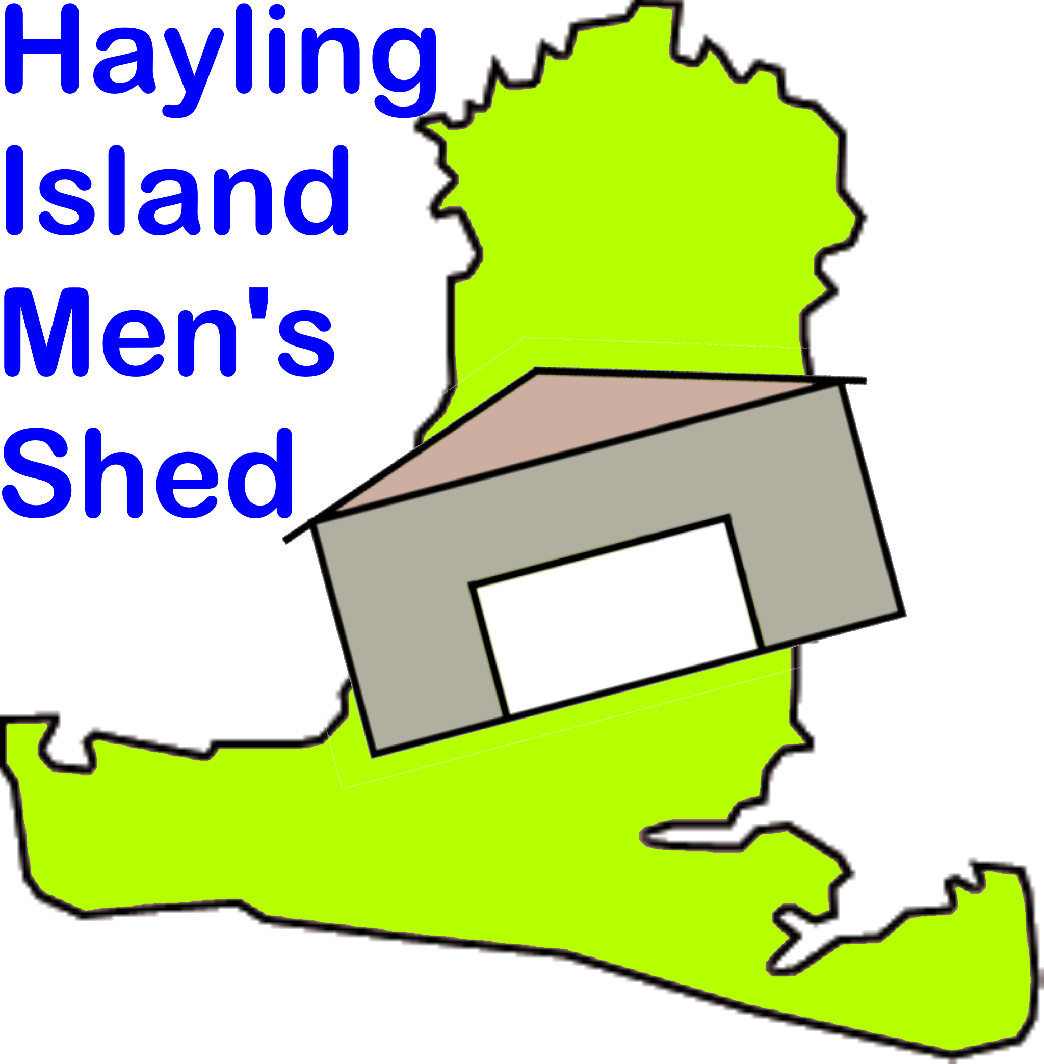
This is the logo I've created for the web site. It's derivative of the logo on the last site but replaces the picture of a wooden shed with a schematic representation of the new shed.
I've used a simple image because I'm not a graphic artist, and it's more effective as a logo (you choose which counts most).
The white space in the middle is intended to represent an open (welcoming) door. I've shown the shed at an angle to indicate informality.
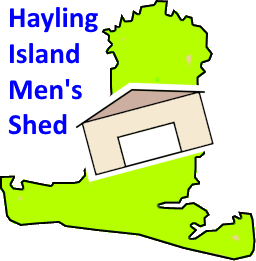
That approach is fine for situations where the shed's name is shown next to it. For example: the heading to this page; or a similar heading to a flyer.
The problem comes when we want to show a name along with the logo. "Hayling Island Men's Shed Association" is a lot to cram in. I've already dropped the "Association" from the web site title (I think it makes us sound too formal - the previous site did the same). Here are some ways we can incorporate the shortened name into the logo...
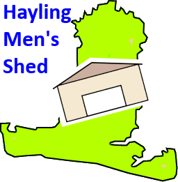

As you can see, the briefer the text, the more readable.
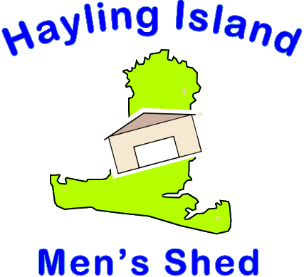
The first example might be appropriate when we want the logo to be meaningful, stand-alone. The last could be good where the logo needs to hint at what it means, but can't be large - perhaps on sweat shirts.
This is my attempt to reproduce the existing shirt logo but - to my taste - it's a little bulky...
The logo images all have a transparent background so they can be used on top of a coloured area, for example:
I produced this version for use on a flag. It is larger than the others and is designed to work well with any background - the pink is added to show where the image is transparent: